
Agency: Draft FCB, Malaysia
CD: Yap Pow Hoong
AD/CW: Reza Adullah
Brilliant or amateur?
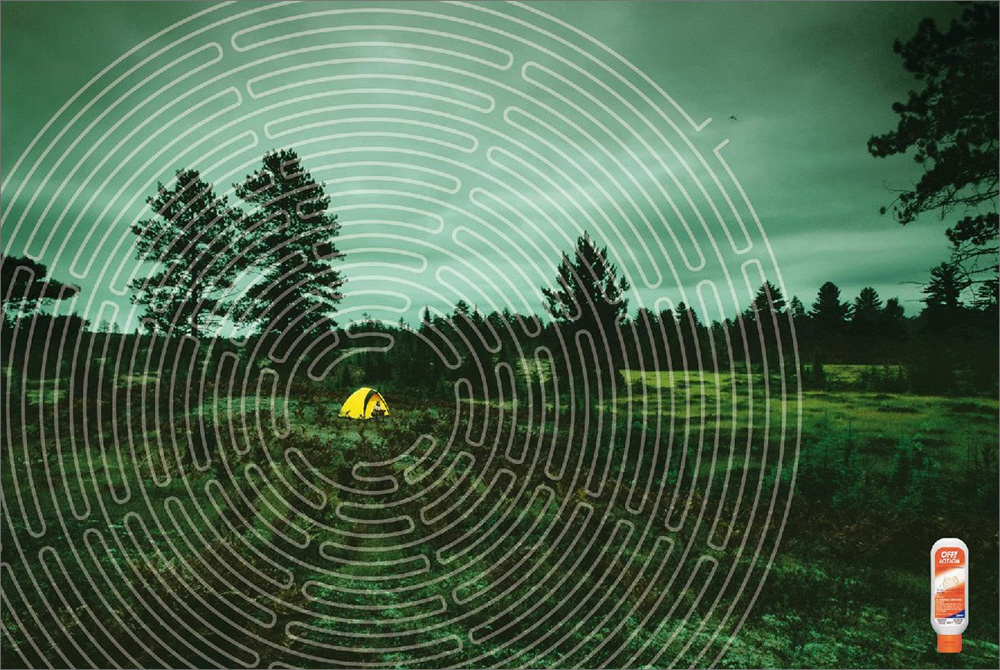
This campaign utilizes a nice visual solution that translates across languages and cultures. It dramatizes the benefit of Off quickly and succinctly. Or does it?
What do you think? Are these ads saying that Off will prevent mosquitoes or simply delay them? Does it matter or does the perceived message differ from the actual message?
Also, is using a maze really that fresh and new? And are these two separate ads or really the same ad twice?
To weigh in for a second, I like these ads. They're smart and instantly communicate that Off protects one from mosquitoes. It's not an issue to me that the messages are a bit off (no pun intended, seriously) from one another. I do however think that this is simply a one-off ad. There's no new material creatively from one ad to the other. I suppose what I do like most is the instant hit. Despite being an insect repellent ad with no specific tone visually, the use of the maze with the mosquito hovering outside gives it a fun feel, like they're letting the audience in on a joke. I also love the use of the radial shape of the maze almost as a force field around the subject. Overall, smart but perhaps need further exploration to campaign it out. What are your thoughts?
ANDYVISION - watch me try to be creative. live.
Saturday, September 8, 2007
Getting Off
Escrito por
Patio Action Pearson
a las
10:27 AM
![]()
Labels: advertising, print
Subscribe to:
Post Comments (Atom)


No comments:
Post a Comment